Thursday 30 July 2009

Monsieur Insoumis

This is the third in a series of Rouen characters I will be posting. His treatment is different to the previous two, partly because I have gone back to pencil (my first love) and partly because I'm still experimenting with using scanned textures for colour. Don't forget to click for a closer look.

There is an anarchist bookshop near where I live. It's not easy to glimpse inside because it's only occasionally open and then only at certain times of the day (ie. when the police are at lunch – this is France, remember). Even when it is open the owner seems determined to keep his clientèle limited to a trusted few; the look he gave me when I last peered inside wasn't welcoming. Was it my shoes? In any case, I'll have to go elsewhere for my subversive pamphlets.

The shop, in its usual shut-up state, has its windows covered by lift-down wooden shutters, painted in burnt-barricade black. Just in case anyone still doesn't think that political power is accursed, the following words of the great Louise Michel are stencilled there in white:

'Le pouvoir est maudit, c'est pour cela que je suis anarchiste!'

We inhabitants of Rouen recently received an official letter telling us to report to our local police station to be vetted. This was so we could declare our race, sexual orientation, political views, and to state which trades unions we belonged to. Obviously it was a stunt. I don't know how many actually turned up to do this, or who was to blame, but my guess is that Monsieur Insoumis knows something about it.
Tuesday 28 July 2009

The Dishwasher Dragon


Just for fun, here is the Dishwasher Dragon. He gets his name from the fact that I used only items from the kitchen sink to colour him: rubber gloves for his scales, head and wings, a sponge for his soft underbelly, and the red bristles of a washing-up brush for his, well, for his bristles. The bubbles were lifted from photos – I didn't even try to scan those.

He's not of publishable quality -- just for fun, remember -- but he's certainly a big colourful step in the right direction in terms of a new picture book technique. Click for a closer look, (but watch your tea-towel).

Friday 24 July 2009

Monsieur Chevaline

This is the second in a series of Rouen characters I will be posting.

When we moved to Rouen it was to a flat in one of the most pungent streets in the city, off the bustling market square of St Marc. The shopping was fantastic, but the gutters ran with fish juice and brown cabbage on market days. The courtyard entrance to our building was, at that time, flanked by a greengrocer on one side and a horse butcher's shop on the other.

Well, 'shop' might not be the right word – it was more of a kiosk. When Monsieur Chevaline was open for business the front extended into the street, extended in fact beyond the shade of the stripy awning above it. The enormous red sausages he sold were therefore part-cured in the sun, as well as being lightly seasoned with fag ash as he leant proudly over his wares. Behind him there were posters of prancing ponies, cute enough for the wall of any little girl's bedroom.

I didn't shop there. I don't believe a horse is something that should be eaten, at least not by anyone who isn't living in the Pleistocene. And I'm not the only one; someone who owns a fat black, wedge-nibbed permanent marker wrote 'Barbare!' and 'ça se mange pas!' on the shutters one night. It wasn't me. Honest.

M. Chevaline is long gone now, but I do have one particularly clear image of him, vivid enough for a memory drawing.

Just inside the courtyard, set halfway up the grubby brick wall, was a metal door exactly like something from an elderly submarine. I only ever saw it open once. Monsieur Chevaline stepped out, wearing his bloody apron and holding an evil-looking blade.

He was chewing something tough.

'bon shooer,' he scronched

I suppose it might have been an After Eight mint.

Thursday 23 July 2009

Rescued Pages


I love searching through my old drawings. I should have done it before. But there have been some nasty surprises too, such as discovering a sketchbook which my younger son had ripped apart. My younger son and my youngest critic it seems.

In one sketchbook I found these small drawings of my wife and our energetic cat. If you look closely (by clicking on the image) you will notice that there is also a bump in this picture. That's my younger son again.

This page was damaged, and the drawings themselves were so off-hand that I had done them over the top of heavily corrected plans for some building work. Fortunately, Photoshop can clean all that up. Shame it can't change nappies too.

Wednesday 22 July 2009

Monsieur Antiquaire


This is the first of a series of Rouen Characters I will be posting.

I have noticed Monsieur Antiquaire working or lurking at the Antique Market at St Marc (Saturday mornings) ever since we moved to Rouen in 2003. He's almost as wide as he is tall and seems perfectly adapted to the loading and unloading of not-quite-antique furniture. I have never seen him without a roll-up. But then, come to think of it, I've never seen him roll one either.

Naturally, this is a memory drawing. I wouldn't want to be caught giving him furtive glances.

The quip about horse sausage isn't entirely flippant. There was a small boucherie chevaline near the market place, but you'll have to wait for the next Rouen character to find out more about that.

As for the drawing, I have been experimenting with using scanned fabric to colour line-work. I'm pleased with where this is going.

Don't forget to click for a closer look.

Thursday 16 July 2009

Timothy Moore


Looking for an excuse to have another try with Photoshop, I found this old portrait of the composer Tim Moore, for many years my landlord in Cambridge.

I think I have better preserved the lines from the sketch this time, although the pencil drawing itself is a little overworked and dense in parts. The colours are from Photoshop's palette and were only quickly added.

And what colours! Just in case anyone's wondering, the turquoise T-shirt under a claret-pink corduroy exterior is quite accurate. Timothy Moore, who lived in the scruffy basement of his town house while the rest of us inhabited rooms in the floors above, was a genuine, unconscious eccentric. The son of the Philosopher George Moore, and the nephew (I think) of poet T. Sturge Moore, there was more than a whiff of Bloomsbury about Tim. That and recycled cigars (one butt rammed into the end of another) and heart stew. He was a gentleman, a champagne communist (which, sadly, made him vulnerable to his tenants), and a believer in a cashless society, phonetic orthography and Jazz for children.

He died in 2003.

Wednesday 15 July 2009

The Mighty Sprick


I'm posting this not because it's a great example of line and colour (and it's certainly not a prime piece of metrical writing) but simply because it reminds me that often a sketchbook is nothing more than a diary. This page brought back some warm memories of holidaying in the Dordogne with friends, sketchbooks and bikes.

Everyone else had to make do with their own machine, but I was lucky enough to find a Sprick in the shed at the gîte. Soviet made (or so I like to think), the Sprick was the last word in uncontrolled speed, inner-ear-rattling aerodynamics and here-I-come squeakiness. Seeing me rounding a corner on the valley road to Gavaudun must have been like 'being there' at an historic Tour de France in the early 1950s as Britain came last. But I didn't care -- I had the wind in my hair, rust on my ankles and stomach full of chips and rosé from the Café des Sports. And I didn't touch the brakes once.

Monday 13 July 2009

My Picture Book Style


Here's another vignette. The coloured pencil gives a lovely soft finish and the line is appealing, but not very precise. This makes small details difficult, but provides a fluffy, child-friendly finish overall.

The Cramps!


This vignette is a sample of my picture book style as it is today. The technique requires several layers of ink on coarse-grained paper, with coloured pencil brushed or (more often) pressed over the top, and then highlights added if needed. It gives strong images, but it's actually quite a strain to keep up the pressure in the tips of my right fore and index finger, and thumb. This might sound surprising, but try keeping that very localised exertion up across twelve spreads (with backgrounds) and a cover. By the end of a project, I usually have shooting aches up my arms and across my back, and increasingly my hand gives up altogether and won't allow me to press with the pencil at all! This is one of the reasons I'm looking for a change in style.

Saturday 11 July 2009

Italian Sketchbook 1


This other sketch was made in the town square of Mondovi, in Italy. Although it's another cramped scribble, I'm particularly pleased with the sun and the cloudless sky (which would have been easy to ignore), the darkness of the roof, and with the little old man loading books into his van.

Egyptian Sketchbook 1


Digging through a sketchbook from 2002, these pages stood out. They date from a time when I rarely hesitated to whip out a pocket (usually Moleskine) sketchbook to tackle almost anything that took my fancy. That's definitely an attitude I'd like to get back. The fact that all these sketches were made in shadeless places in a hot climate -- as is clear from the sweat-crinkled edges of the paper -- reminds me that back then I was committed enough to the sketchbook habit not to care too much about personal discomfort. Something else that's gone!


These Egyptian pages were sketched from the deck of a slow moving cruise ship. There was just enough time to get into the drawing, but not nearly enough to be fussy or precious about what I was putting onto the paper. So no time to overdraw.

Friday 10 July 2009

Some Photoshopping


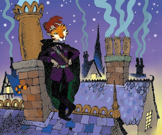
Here is detail from a picture based on a short story I wrote about a twelve-year-old cat burglar. It's about as far as I've ever gone with colour in photoshop, and I think my inexperience shows. I realise that most graphic novels are coloured by someone other that the artist, and I can well believe that it's an art in itself. It's certainly time-consuming.


The main interest, of course, is the quality of the line work, which has come out rather well in some places (cloak and trousers) though not so well in others (tunic). In general it's not as dark or as crisp as I would like, not even in high resolution. The line is black ink on plain cartridge paper, and the pen is a 0.8 Artline marker that has a dryish nib. Its line breaks nicely on coarser-grained surfaces than cartridge provides but I wanted to be able to move the nib about the paper more freely.


In Photoshop, It might have been a mistake to select and copy half-tones of the line drawing as a separate layer, because the flattened image has some pale edges that spoil the quality of the line in places. I'm still groping my way through the technical stuff.

Thursday 9 July 2009

What I'm Looking For


We're all after it: a crisp, charming yet useful, bande dessinée style. And that line, that sensitive, varied mark -- which looks effortless on the page but which is so bloody difficult to pin down -- is the key to it. I haven't found this line yet, but then I've only been looking seriously for a short while. Sometimes I have the feeling I'm getting close, only the cramps kick in, or the ink flows too free, or some shelves need putting up, or...


Well, anyway – I know it's out there somewhere. I'm told that a blog might help me find it. At least it should give me an excuse to do a drawing every other day, to explore Photoshop's tidy-up-and-colour-in potential further, and to invite helpful comments from others. Please.


As a writer, I'm also looking for another type of line altogether, and I may leave posts with no images in them at all! I've come a long way since art school.

Some years back I managed to maintain the sketchbook habit, sometimes for months on end. Sadly I have let this slip. Being a father of two very small boys doesn't help. Lately however I have been making more of an effort, and I hope to get that scribbly, heat-of-the-moment sketchbook spirit back, when the hand and eye are ever-ready to capture the scene in a mark or two. After all, this is usually when the nicest lines occur. I'll be looking back through my old sketchbooks and posting the odd page here, just to prove that I at least know what that famous line looks like!


Above is a sketch from the first of May 2009, one of the few times my sketchbook has been open this year. It's a very modest little drawing, but for once I think I really captured the moment: little Benjy's thorough enjoyment of his cookie.


But that's not the line.